Integrated Supply Chain
Traceability Map for Luxury Fashion
What is the Problem?
- The sustainability team struggled with fragmented traceability views, relying on manual screenshots and tools like Power BI to compile reports—making the process inefficient and error-prone.
- The brand raised concerns about the platform’s value and made contract renewal dependent on delivering a more integrated, streamlined solution.
To dive deeper into the challenge, I conducted user interviews with sustainability managers. I also analyzed platform usage data to understand how users interacted with the different views.

Project planning board showing problem mapping and requirements for the integrated supply chain solution
Key insights from research
- Similar node colors and unclear arrows made it difficult to distinguish supplier types and understand production flows.
- Users recommended distinct color coding by process, risk level overlays, and a clear map legend to improve interpretability.
- Filtering by supplier or product ID did not display the full supply chain or reflect accurate production flows.
- Users expected visualizations to dynamically adjust based on filters, showing only relevant processes and connections.
Users required a seamless, integrated Map views to filter and visualize sustainability data without switching views. They needed to see connections between geographic, network, and risk data simultaneously.
Client raised concerns about platform value, prompting urgency for an improved solution. Contract renewal was explicitly tied to the delivery of an integrated visualization solution.
The integrated view needed to maintain the clarity of individual data representations without creating visual overload.
Filters had to apply across all views simultaneously without slowing performance or creating confusion.
The solution had to be scalable to accommodate future traceability requirements and additional data points.
We needed to balance comprehensive data visualization with performance, especially for users with extensive supply chain networks.
Design Approach
After gathering insights, I collaborated with stakeholders to explore possible solutions. We evaluated these ideas based on feasibility, usability, and impact.
A tabbed approach allowing users to switch between views quickly.
A combined visualization where all views were integrated into a single screen.
A customizable map view where users could toggle specific data layers based on reporting needs.

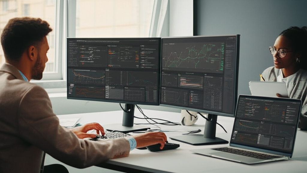
Designer and developer collaboration session working on the supply chain visualization interface
Design Iterations
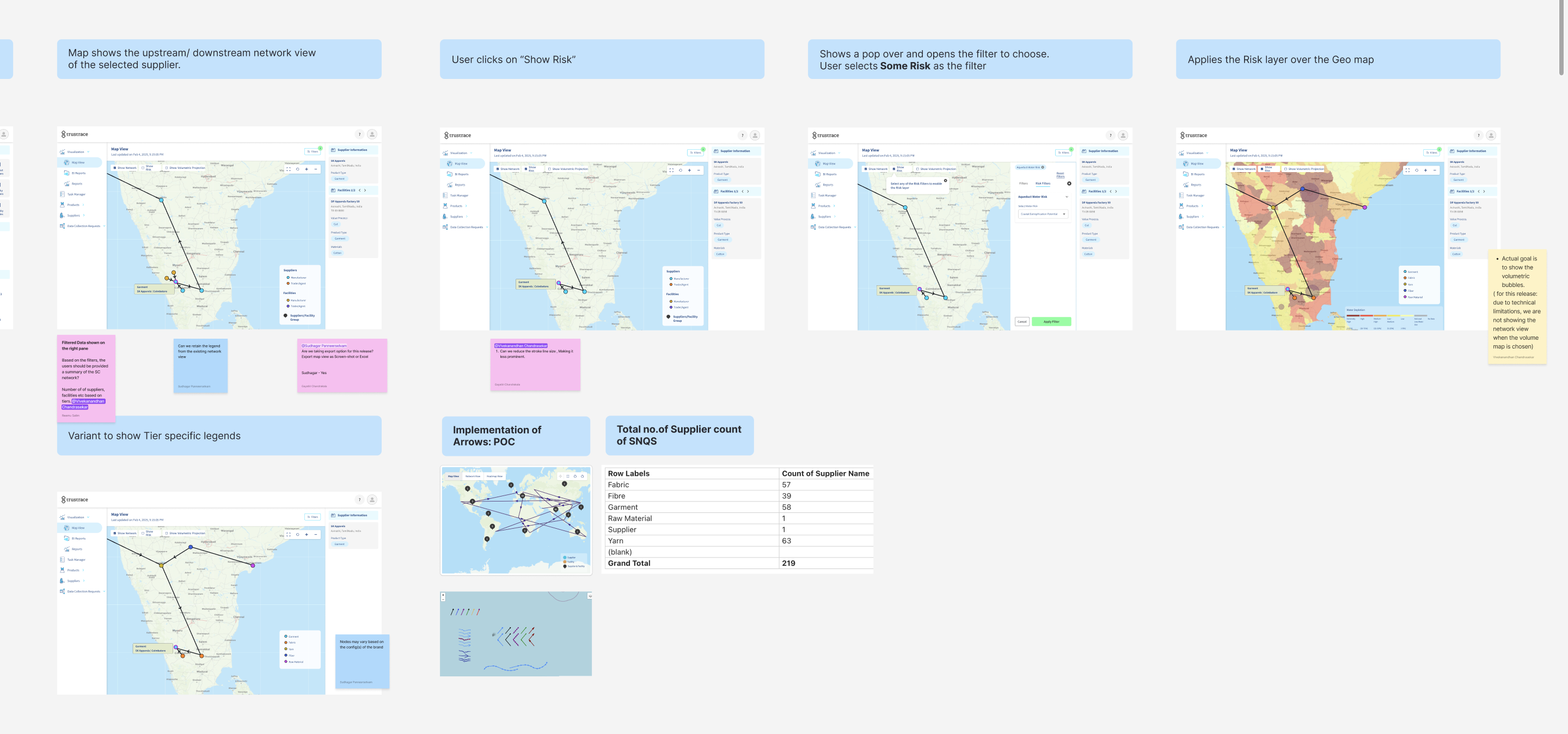
Progressive iterations of the supply chain map interface showing network views, risk filtering, and data visualization approaches
Audit & Breakdown of Existing Views
I began by breaking down and analyzing all UI elements across existing views—filters, legends, touchpoints, controls, and static data in Supply Chain, Network, Risk, and Volumetric views.
Unified Design Proposal
Based on this, I proposed a unified design: a common filter section, shared map legend, and a consolidated network view to reduce redundancy and improve clarity.
User & Stakeholder Validation
These concepts were prototyped and tested with sustainability managers and internal business services to validate usability and alignment with real reporting workflows.
Usability Testing
We conducted usability testing sessions with sustainability managers from luxury fashion brands to validate our design solutions. Participants were asked to complete typical reporting tasks using interactive prototypes, providing valuable feedback that informed our iterative design process.
Remote usability testing session with sustainability managers from multiple luxury fashion brands
Visual Clarity & Color Distinction
- Similar node colors and unclear arrows made it difficult to distinguish supplier types and understand production flows.
- Users recommended distinct color coding by process, risk level overlays, and a clear map legend to improve interpretability.
Filtering Logic & Data Representation
- Filtering by supplier or product ID did not display the full supply chain or reflect accurate production flows.
- Users expected visualizations to dynamically adjust based on filters, showing only relevant processes and connections.
Usability, Errors & Testing Concerns
- Users encountered bugs like incorrect heatmap visibility and volume discrepancies during prototype testing.
- Filtering issues impacted user acceptance testing, raising concerns about reliability but not halting interest in proceeding.
High-Fidelity Design
The final design included a consolidated supply chain map view integrating all four views (Geographic, Network, Volumetric, and Risk), a global filtering system, and interactive visual elements to highlight key sustainability metrics dynamically.

- Integrated Geographic View: Shows supplier locations with color-coded risk indicators and connection lines representing material flow.
- Key Metrics Dashboard: Provides at-a-glance sustainability metrics and compliance indicators in a compact, scannable format.
- Interactive Legend: Allows users to toggle different data layers and visualizations based on their specific reporting needs.

- Unified Filtering System: A global filtering panel that applies filters across all views simultaneously, eliminating the need to reapply filters when switching contexts.
- Multi-parameter Selection: Allows filtering by material type, certification status, risk level, and geographic region in a single interface.
- Real-time Visual Feedback: The map and metrics update instantly as filters are applied, providing immediate visual feedback on the filtered dataset.

- Detailed Supplier View: When a supplier is selected, users can see detailed information including sustainability metrics, compliance status, and historical performance.
- Connection Visualization: Shows upstream and downstream connections in the supply chain, highlighting dependencies and potential risk areas.
- Risk Assessment Panel: Provides a detailed breakdown of environmental, social, and governance risks associated with the selected supplier.
Developer
Collaboration
Working closely with the development team was crucial to ensure the technical feasibility of our design solution. We held regular sync meetings to discuss implementation challenges and find solutions that balanced user needs with technical constraints.
Designer and developer collaboration session working on the supply chain visualization interface
Third-Party Dependency & Design Constraints
- The design followed a bottom-up approach, as the map, network, and risk views were built using third-party libraries. This introduced technical constraints that shaped our design decisions.
Cross-Functional Collaboration for Feasibility
- To ensure feasibility, we worked closely with developers to understand the UI library’s capabilities and limitations. Through this collaboration, we aligned on what could be delivered immediately and what needed to be deferred.
Prioritization & Incremental Delivery
- For instance, overlaying volumetric and risk maps posed integration challenges and was scheduled for a future release. Despite these constraints, we successfully delivered a solution that met most critical user needs.
Impact & Results
After implementing the new integrated view, we saw significant improvements in user efficiency and satisfaction, as well as positive business outcomes.
60%
Reduction
in reporting time as users no longer needed to manually compile data
40% Increase
in user engagement, with sustainability managers spending more time in the application
Contract Renewal
of a critical luxury fashion brand's contract with TrusTrace
Final Thoughts
This case study showcases how UX design can drive business value by improving user efficiency and increasing customer retention. The solution not only streamlined reporting but also reinforced TrusTrace's value proposition in the luxury fashion industry.
The integrated traceability map has become a cornerstone feature of the platform, demonstrating the power of thoughtful design to solve complex business challenges while meeting user needs.


